Saturday, December 22, 2012

The End of Time


This seemed fitting given that we're all supposed to be apocalyse'd right now. Oh well!

Chrono Trigger, if you don't already know.

Friday, December 21, 2012

Sunset Over Dinosaur Land


Another low-poly render, but this time with the magic of Ambient Occlusion.

Thursday, December 20, 2012

Brinstar


Brinstar from Super Metroid

edit: Updated with Ambient Occlusion now that I've figured out how to add AO to the scene without it coming out all black or overblown.

Wednesday, December 19, 2012

Lost Woods


Expect quite a few of these low-poly renders, they're quick, easy, and fun.

Can't say how many among them will be fan art, however.

Low Resolution

Alright, so I love the guys over at Geo A Day and I decided that since I'm learning some Mayas as well I could attempt to mimic their work. 


My first scene is a little piece of scenery of nowhere in particular, I just wanted to practice on some trees, and mountains, and clouds, and everything else, basically. The Lighting was almost a disaster, but was saved at the last minute by the wonderful suggestions of my friend Quinne (who's blog I would link here, if she had one that I was aware of)

For the second time around, I decided to revisit an old favorite of mine and my friends. You see, I've been wanting to do 3D for a very long time. Back in high school, I asked my mother for a gift in the form of a program known as Bryce. Bryce generates landscapes for you, and you tweak certain parameters. For instance, you can generate a mountain, and then you can kind of tell Bryce what shape you want it to be, and Bryce does all the detail work. The same is true for the sky, the atmosphere, etc. You tell Bryce what elements you want in your scene, and it does pretty much all of the work. With the help of that program, I was able to make this image:


Pretty, yes? All thanks to the program, I assure you. BUT, it was a good way to understand the very most basics of 3D, because it did at least allow you to place the objects in space, and adjust their size and such, even if you weren't allowed to control much else at all.

Anyway, the Bryce work got me a ton of compliments from all of my friends and family because "Hey! That's gorgeous!" and if you don't know how little control over things Bryce actually allows, you might be impressed... But that wasn't enough for me. I want to actually be entirely responsible for the work that I do, and in that vein, I decided to revisit my old work. Now that I've learned some of the Mayas, I'm able to create scenes entirely of my own choosing, with my own lights and geometry. As such, I have created this:


Not quite on the level of Bryce, but much more my style.


Sunday, December 16, 2012

End of Semester 1

WINTER BREAK HAS ARRIVED!

That means we've wrapped up the remainder of our projects, and I have a bunch of stuff to post for various classes.

So to begin with, my 2D Animation assignment. We were told that we had to make a scene involving a character who enters an area and reacts to something. The area had to have an actual background, but that was pretty much all we were told. For mine, I decided to do the simplest section of animation from my film. But hey, this is ACTUALLY a section of my film, and while I'll be reanimating this in TV Paint, this can serve as a preview of things to come.


Next up is 3D. Assuming you've been following my blog posts, you'll remember a post where I showed the untextured models for a mad scientist lab we were working on throughout the semester (and if you don't, it's here: The Third Dimension ). Well the assignment is finished!

The idea here is that an evil scientist has moved into an abandoned church and set up shop. With much thanks to my lighting class, I was able to take my original idea and turn it into pretty much exactly what I wanted.

And lastly, I took a class about the art and spiritual philosophies of India. As the final part of that class, we were tasked with the completion of a piece of artwork, of any kind, that related to our major. Seeing as animation takes too dang long to do, and I've got such a history in art, I decided to do a digital painting. The painting depicts a city from a movie/tv series I'm writing, and it represents the buddhist philosophy that "many roads lead to the same path". I won't go into deep detail, but basically there's a war going on and this city is the neutral party who are trying to find a way to bridge the gap between the two parties by accepting the world as a place of diversity.


Monday, December 10, 2012

Reaching Enlightenment

So this semester I've been sitting in on a lighting class that should be for third years, but I was interested in the subject, so I made an exception for myself and the teacher was fine with it, so woo!

We were given a set of pre-rendered fruit with bowl and cloth background. It was basically doing an oil painting, but with Maya. I thought it was pretty cool.

Anyway, first off we were given the following image to begin with:


Once we were given that, we were told to create three different lights in three different places and make the fruit look delicious. The lights were placed in places that made sense based on the principles of real lighting, we were just adapting them for Maya. Basically, that means we included a Key Light (The main light of the scene, coming from the right in my image), a Fill Light (a secondary light that adds dimension to the shadows), and a Rim Light (a light that comes from behind to illuminate just the edges of the visible objects).


Once we had that, we went into texturing. The orange already came with some texture to it, but the rest of the fruit were smooth and blank. We began by simply drawing a texture in photoshop and applying it to the Diffuse attribute in Maya.


I continued by adding textures to the entire scene, background, plate, and everything in between. He then began to teach us different things to add to the scene to make it look more realistic. Ray Traced shadows, different types of lights and textures, and different options within a texture to adjust the reflectivity, specularity, and a few other things.


And then at the end we added some final touches including ambients (both ambient light and ambient color), some procedural textures, and just some final touches on all the ways that light interacts with the texturings, and then Ta Daaaa! A completed fruit bowl!


EDIT: And now a version with the final Ambient Occlusion added to make everything just look better:


Tuesday, November 27, 2012

Moom Walking


BONUS BLOG! Because I'm done with my assignment of making a ball walk, I've moved on to playing with the full biped rig we're going to be using in the spring.... And next week we're going to get an assignment to make a ball with no arms, face, body or any other form of detail do this same sort of walk cycle! Yay back-tracking!

Friday, November 23, 2012

Jumping Jahosaphat

And now on the legs! This time 'round we were told to animate this mono-legged rig and make him jump. Specifically we were told to make him do 3 different kinds of jumps, and we were warned not to try to do flips because a bunch of previous students had tried and failed. Logically the first thing I did was include not one, but two different flips in my animation because apparently I'm psychotic and I hate myself!

But this time around he introduced us to a nice little button called an IK/FK Switch that would have been a WONDERFUL THING to have on the last few 3D rigs, because I wouldn't have had to animate everything backwards like I did. The IK/FK changes the way the motion works from having it so the foot leads the motion to having it where the ball leads the motion. On FK, the ball moves everything, and you pose the foot to make sense after that. On IK, the ball and the foot move independently, and while it can cause some issues and is less useful for certain actions, it made THIS animation a million billion times easier than the last 2 I did.


Also, as a side note, I've been approved as a member of the deviantArt film community, so all of my animations are now also available on my dA page here at http://xelioth.deviantart.com

Thursday, November 8, 2012

Character Test

Test animation for my film character. We got an assignment in 2D Animation class to show a character coming into frame, picking up an object and then reacting to said object. We were given the option to draw either a Disney character or our own film character, and this time around I opted for my film character so that I would have a chance to explore him a bit before time to actually animate him IN my film.

So here you go, my film character in action. Hopefully the motion is clear, so I don't need to explain it, and just prepare to see a lot more of him as this year goes along. Haven't decided how much of my film stuff I'll be showing here, but there will definitely be SOME kind of preview posted.

Tuesday, October 30, 2012

Squirrel and Tree


Project this time around was to take the ball with a tail and make it live. I decided that since we were given a circus environment, I would take that idea, and have the ball do some tricks. Studied trapeze artists' swinging motions to get the feel of the flip through the ring. I'm pretty happy with it, and it made the class TA stop and gawk for a moment sputtering about how "this is great" over and over again, so I felt pretty special for that one.

ALSO! BONUS POINTS! I had some time for personal drawing for once! We had a class intro to photoshop, and while the newbies to the program were learning the basics, I crapped out this little drawing!


Drawn first in my sketchbook, scanned, and then traced over in photoshop. Color is all digital.

Tuesday, October 23, 2012

Great Balls of Maya


So I've done 2D Animation balls and NOW I've done 3D Animation balls. Yay Balls!!

I want to note that I deserve like 5 million extra bonus points for this chain animation. The only part of the chain that can move is the top of the chain. The ball cannot be edited whatsoever because of the way it's rigged. The way I had to edit the ball/chain was to move the chain to the position I wanted it, then turn the ENTIRE RIG around to put the ball back into place where it looked like it rolled naturally.

I don't know how to explain it more than that. Hopefully that makes my headache clear for you guys.

Wednesday, October 17, 2012

Kingly Turn of Post


Last time on Temple of the Bald Messiah! Our hero was given the task to create a bouncing ball using only a piece of paper, two pencils and a camera! After completing this most epic of quests, he has found himself with instruction to turn the head of a famous Disney character! This tale of adventure, heartache, wonder, and woe has been preserved for your viewing pleasure in the video above.

Stayed tuned next time as we see our take on the twin dragons of Character Design and Realistic Action!

(btw, do yourselves a favor and click the full screen button on the bottom right of the above video)

Sunday, October 7, 2012

THE THIRD DIMENSION!

So I've been taking a class in 3D Modelling, and we were given a theme to fit into with all of our props. Our first week we were required to make one prop of any kind. Most of my classmates created a glass vial or a bottle or what have you, I created this:


And then I created this on top of it:


The second week we were required to make two props of any kind, and I forged these two from the fires of Maya


The third week we made a complete object in class since everyone was getting the hang of the program a little better, and that was this object:


And then the class was over and we were assigned two additional props to be turned in this tuesday:


I also have already created a desk for the book to rest on and a control panel for the power generator to be used. I'm going to add a larger part to the generator to make it seem like it's really puttin out some juice.

We haven't learned any form of texturing or shading, so the only thing I know enough to do there is to drag and drop a Phong or Blinn onto these, and that really wouldn't do any good so I'm leaving them grey until I'm instructed on proper texturing. I look forward to all of these being part of a cohesive scene with walls and lighting and the like.

Monday, October 1, 2012

Vikings 2: Asgard Strikes Back

My character design teacher made us revisit our viking designs from the previous week and in doing so I finally nailed using the shapes he's been trying to get us to focus on while maintaining my particular graphic style. The result? The first designs I'm truly proud of, and the first said teacher has ACTUALLY complimented. He said he's worked on some shows that looked like this. :D

Monday, September 24, 2012

Viking Invasion


Viking character concepts done for a character design class. Got compared to Mike Mignola by Rick Maki. I am totally ok with this comparison.

Friday, September 7, 2012

Spirited Concept

So I was drawing in my sketchbook and an idea developed. A cartoon series about a girl witch who summons the spirit of a warrior, but in doing so gets wrapped up in a chaotic, political mess of a situation going on in the spirit world beyond the mortal pale.

This reminded me strongly of a story concept that my best friend has been working on occasionally for years now, and since it's her birthday tomorrow, I figured I'd go ahead and adopt her characters and make it a little fanart sort of thing for her birthday. Instead, I'm likely t wake incredibly mixed feelings and possible ire as she screams at me for raping the good nature of her characters, BUT OH WELL I'M A TERRIBLE PERSON AND I DID IT ANYWAY!!

anyway, here's the concept artwork:


Thursday, July 12, 2012

Brush Stroke of Genius

So yesterday I contacted someone via DeviantArt and asked them what brush they used to get the textures found on their work. I've done this a few times and usually it ends up being a stamp brush or something else that I find either useless or annoying to work with. Well yesterday I struck gold. I found a textured brush that works EXACTLY how I want it to and yields a style that I've been wanting to work with for the longest time. So here's some random doodles in order of when I drew them last night. An hour and change was spent on each of these, a speed that makes me as happy as the look and feel of the brushes.


Friday, May 18, 2012

Art 318

For my final quarter at Louisiana Tech University, I was enrolled in one of the most difficult classes a Studio Art major can take, Conceptual Design - Art318.

In this class we were given vague themes to work with and told to create something profound within the theme. However we imagined that theme could be presented, whatever media or technique we wanted to use was fair game, our job was only to present something in the best way we could. For me, I felt that way was through digital illustration, and so 3 of my 4 projects were exactly that. The fourth project won't be shown here because it was a sculpture done in a way that makes it EXTREMELY non-photogenic.

Anyway, first up was the theme of Time. I decided that Time is a journey to be traveled. We have many goals and places we would like to go, and at all times the distant future looks far better than the nearby present, but we never really know where we're going to end up. We definitely don't know what path we're going to take or what hardships we're going to encounter.... Or at least that was the idea.... No one really got that from this drawing. They said it was pretty though, so it wasn't a complete loss...

The second project was Body/Identity. To me, identity is defined by the trials you overcome to reach your goals, and the things you leave behind as you try to get there. I tried to show this loss through objects referencing the dreams of various facebook friends who I asked to list me their dreams from childhood.


The third project, which won't be shown here, was Place. For this, I crafted a small sculptural island paradise and placed it within a small, cracked box with light pouring through the cracks. The piece was more along the lines of what everyone else in the LATech art department looks at as "Fine Art" and so they considered it my strongest piece of the quarter. The plain, black box is rather boring to look at through photo, however, so you don't get to decide whether they were right.

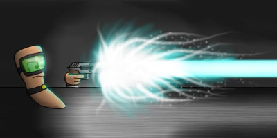
Finally, my fourth project was Science/Spirituality. For me, spirituality and science are both the same thing. Salvation being brought to the masses in the form of knowledge. Whether you believe in the divine or believe in only the irrefutable facts of science, your goal remains the same; teach the world around you so that they might understand things as clearly as you do. Unfortunately, when you try to teach someone something they don't want to know, they tend to rebel against that knowledge and show hostility towards you. The true test of your beliefs is always whether or not you are willing to face down that hostility and continue your quest anyway. This illustration is how I chose to represent that:


By the end of the quarter, I proved two things. First, I proved that I have improved immeasurably over my pre-college self in that my use of color and composition have come leaps and bounds forward. No one could levee a single complaint about the actual drawings I was presenting. Unfortunately, the second thing I proved is that I, in no way, belong here at LA Tech. Every other artist in the class complained that my drawings weren't presented in some interesting and unique way that redefines what it is to be art. My Place assignment was just to appease those people and show them that I can participate in the nonsense just as well as they can, but I choose not to. They don't get me any more than I get half the artwork I was presented throughout my time in the class (from professionals, not other students. I understood my fellow students' works well enough). Two wildly different parts of the art world, I guess.

Friday, April 27, 2012

Benchmarks

Through the years, I have repeatedly drawn one particular image over and over again. I've done this as a benchmark for my skills. The first one was simply a drawing of a character an online friend invented. The second was as I was learning to draw a bit better and felt like I had improved enough in my knowledge of the program I was using to make something notably better. The third was after I finished reading a book called Action! Cartooning, which helped me to improve immeasurably beyond what I was capable of before. The book taught me tons about character design and putting life into a drawing. Now this final benchmark is the results of my experience and teachings at LA Tech University school of art, as well as my extracurricular studies (mostly related to composition and such for film, but I've applied it to art several times over).

Anyway, I just thought this was an amusing look at how far I've come in the last 7 years.


 2005. MS Paint & Fireworks MX.  Line Tool drawing.


2007. Fireworks CS3. Vector drawing.


2008. Fireworks CS3. Vector drawing.


2012. Photoshop CS4. Drawn by hand.

Thursday, April 19, 2012

Cal Arts Portfolio

Ever wonder what a portfolio that gets you accepted into one of the top art schools in the world looks like?


WONDER NO MORE! This is the portfolio I shipped to CalArts (minus the sketchbook and life drawings)


ILLUSTRATION


PAINTINGS


CERAMICS


ANIMATION